So @Former-Member
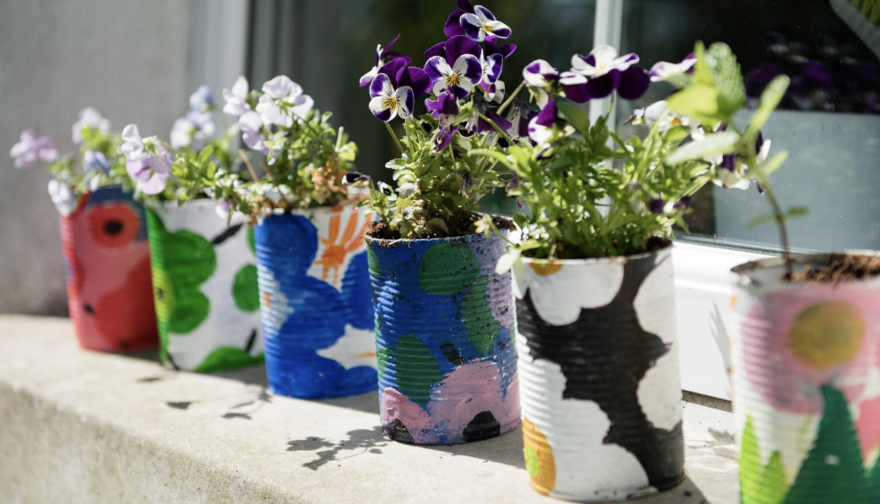
I put your picture through Ai to see what that said - I wanted to just write - oh these colours are fresh and happy but I thought ide see what quick and easy Ai wrote -
Absolutely! Let's break down the color palette in this image:
Dominant Colors:
* Pink: A bright, almost magenta-leaning pink is prominent in the central flower and the upper left corner design.
* Green: Two shades of green are used: a vibrant lime green and a slightly darker, more muted green.
* Yellow: A bright, sunny yellow is used in several sections.
* Blue: A medium blue is used for dots and outlines.
* Purple: A medium purple is used in concentric rings.
Other Colors (Less Dominant):
* Orange: A warm orange is used in the central flower.
* Red: A bright red is used for dots.
Color Characteristics:
* High Saturation: The colors are generally very saturated, meaning they are bright and intense.
* Warm and Cool: The palette balances warm colors (pinks, yellows, oranges) with cool colors (blues, greens, purples).
* Complementary Contrast: There are some instances of complementary colors (colors opposite each other on the color wheel) being used next to each other, such as the pink and green, creating a vibrant contrast.
Overall Impression:
The color palette is cheerful, energetic, and playful. It's reminiscent of a children's coloring book or a mandala design meant to be fun and engaging.
Let me know if you'd like any more details about the colors!